
Sunday, 2 October 2011

Logo take 3

This process has been harder than I thought. Version 3 makes use of a unique font and I like the holding ribbon...but despite the big black heart above, I'm still not loving it.
Logo take 2

Back to the drawing board...version 2 uses Pete's sketches in a frame, and we've lost the slashed 'O'. I like that it's a bit wonky, but the hand drawn font might not look good when laser cut into wood.
Logo take 1

I've been working with a designer to come up with a logo for my business. This version captures the idea of pieces of wood coming together to form a new creation, but it still misses an icon and I don't really identify with it.
Monsieur Dior meets the Sopranos
I bought this hat in Rome, but lost the black mafia ribbon it originally came with, so I thought it's time my R5 Monsieur Dior investment paid off...

Monday, 26 September 2011
Best 12 bucks I ever spent
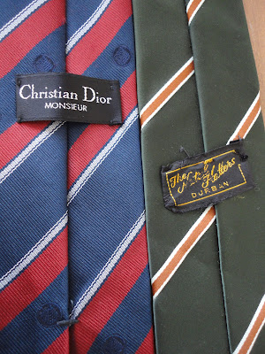
Two vintage ties, R5 each
 One of them sporting a real larny label
 A couple of old-school par avion envelopes, R2 for the lot
 = R12 well spent

One of them sporting a real larny label A couple of old-school par avion envelopes, R2 for the lot
 = R12 well spent
Shopping spree courtesy of Hospice and Red Cross shops in Knysna
Tuesday, 6 September 2011

Subscribe to:
Posts (Atom)

